film poster
1 eon studios ✔warner bros
2 universal✔
3 eon studios✔
4 universal✔
5 amazon✔film poster introduction
1. which are the big 5 major hollywood studios Disney, Paramount, Sony Pictures, Universal Pictures, and Warner Bros
2. what is the main aim of a film marketing campaign
The primary goal of a film marketing campaign is to create awareness, build anticipation, and ultimately drive ticket sales, aiming to maximize the film's profitability.3. what marketing techniques are often used
Common marketing strategies include content marketing, social media marketing, email marketing, SEO, PPC advertising, influencer marketing, and event marketing.
4. what information does a film poster need to convey
A film poster needs to convey several key pieces of information to effectively promote a movie. This includes the film's title, tagline, release date, and often the names of the main actors and director
5.whats the difference between a teaser poster and a theatrical poster
A teaser poster is a preliminary promotional poster for a movie, released early in the marketing campaign to generate interest and anticipation. It typically has minimal information, like a tagline or a single striking image, to pique curiosity without revealing too much about the plot. A theatrical poster, on the other hand, is the main promotional poster released closer to the movie's theatrical release, containing more detailed information like the title, actors, and a more comprehensive visual representation of the film's atmosphere.
6. name a recent film franchise
spider-man
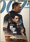
The poster for No Time to Die, the 25th James Bond film and Daniel Craig’s final outing as the iconic spy, features a bold and modern visual design that honors the franchise’s legacy while adding a contemporary edge. The main image typically centers on James Bond himself, dressed in a sharp, dark-toned suit or tuxedo, holding his signature weapon, with a steely, determined expression. The background often uses a sleek, minimalistic urban setting or abstract textures, reinforcing the film’s tone of suspense and high-stakes espionage. The composition keeps the focus on Bond, often placing him in a dynamic stance that conveys action and urgency.
The color palette of the poster leans heavily into a classic yet striking combination of black, white, and gold tones, complemented by muted blues and greys . These colours evoke sophistication and danger—hallmarks of the Bond aesthetic. Black dominates Bond’s outfit and the shadows, while white and light grey elements balance the design and highlight key features, such as his face and the title text. Gold or brass accents, when present, subtly hint at luxury and tradition, tying into the long-standing visual identity of the series. Occasionally, hints of teal or desaturated blue inject a colder, modern edge, reflecting the film's themes of betrayal and legacy.
The logo for No Time to Die is particularly distinctive, using a custom geometric typeface that breaks the words into a grid-like arrangement. The typography is bold and all-uppercase, with a modular, blocky structure that is both futuristic and reminiscent of mid-century design. This echoes the film’s dual focus on nostalgia and forward momentum. The clean lines and uniform letter spacing give the title a strong visual impact, making it instantly recognizable and easily legible at a distance. The placement of the iconic "007" logo, often integrated with the gun motif, ties the visual branding directly back to the Bond franchise.
Typography across the poster follows a minimalist, sans-serif style that complements the custom title font. Supporting text, such as cast names or credits, is often rendered in thin, high-contrast fonts that don't compete with the title but maintain a refined look. The use of clean lines and careful spacing reinforces the sense of precision and elegance. Overall, the poster’s design—through image, color, and type—projects a cool, calculated atmosphere that perfectly encapsulates the tone of No Time to Die while honouring the suave, enduring legend of James Bond.
narrative
genre
release date
representation
narrative
do now
1. a large company that owns other companies
2. merging two media
3. two brands that benefit each other
4.
5.
film posters
to analyse the film poster set text effectively
sophisticated

theres variants of characters and the gender equality but the woman are still objectified because there not wearing more revealing clothes than the men which means there more sexualised and objectified
mison sen is the arrangement of everything visible within a scene, including actors, props, costumes, lighting, set design, and the overall visual aesthetic.
logo 007 known brand existing audience
genre is action based on mison sen . props and guns
intertextuality
overlaying of images refers to previous bond pictures
props character type
do now
1
2 storyline
3 setting costume
4 the style and appearance of letters
5 type of film
intelegent white good looking is in a suit
image
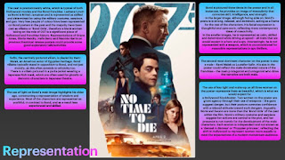
the james bond poster shows all of the main characters including james bond as the largest character. this shows his importance and role in the movie , he also looks sophisticated because hes wearing a suit and looking sideways . in the image we can see 3 girls , one of which is wearing combat gear and has a gun this shows she isn't being portraid as the stereotypical female character , but the other girl is wearing a long dress which sexualises her and shows the stereotypical female . the movie poster has different scenes in this shows how action packed the film will be even before the audience watch it.
the poster shows a woman who is black playing 007 is very unstereo typical because usual 007 is a very masculine male as the spy role but she has taken over and showing that black girls and the black community can act , can do anything no matter the skin colour
the action genre is male dominated because the male characters are bigger and look more sophisticated where as the woman are usually sexualised
2 7 25
1 masculine strong
2 strong
3 mixed and diverse
4 mixed. older
5 propp
mwtgg film poster and media language analysis
lo analyise the film poster
18/6- Excellent notes on analysis here, very detailed. You could have more notes on representation points from today.
the film cost 7 million and made 97 million in box office
released in 1974 this was only moores second appearance as the fictional m16 agent
1973 energy crisis causing oil crisis
very outdated
sexualised
1 shows lots of action
2 sophisticated
3 wealthy
4 coloured to stand out
5
6
the film poster uses images to create meaning through the characterisation of james bond this is shown because he is holding a gun close to him and hes wearing a suit which shows sophistication
do now
1. masculine and strong
2. sexualised
3. asia
4. serious
5. hero villain
mwtgg film poster
to analyse the representation in a historical film poster effectively
black suit sophistication
gold gold
power plant simpsons
who regulates films :bbfc
who regulates radio: of-com
who regulates games :pegi
who regulates newspaper :ipso
sexualised
context of the 70s
racist
sexualising women
stereotypes no black people on there
representation of gender the males are sophisticated but the women are sexualised
representation of ethnicity asia is run down
representation issues and events
feminist . male gaze the woman are wearing hardly any clothes this is aimed at the males the woman are sexualised

1. photography
males 2 females 2
main character female
the mwtgg film poster represents gender through the female charcters because they are sexualised , they are wearing bikinis and this shows how gender eqaulity in the 90s , the males are wearing
18/6- Excellent notes on analysis here, very detailed. You could have more notes on representation points from today.
ReplyDelete